The new branding of 350 Seattle energizes its climate message and connects with a new generation of activists.
View Brand Guidebook

Team
Solo project
Brand
350 Seattle
My Roles
Visual Design
Duration
8 weeks, 2022
Overview
It’s a redesign project for 350 Seattle, Seattle’s local non-profit organization that fights for climate justice. They resist fossil fuels, make a system change, build healthy alternatives, and encourage resilient and welcoming communities. Their current brand lacks consistent visual language overall and is not strong enough.
My role was to rebrand their visual system to make 350 Seattle more narrative and deliver their brand identity more vital so that they can visually communicate more effectively what ‘350 Seattle’ does.
Context
Background
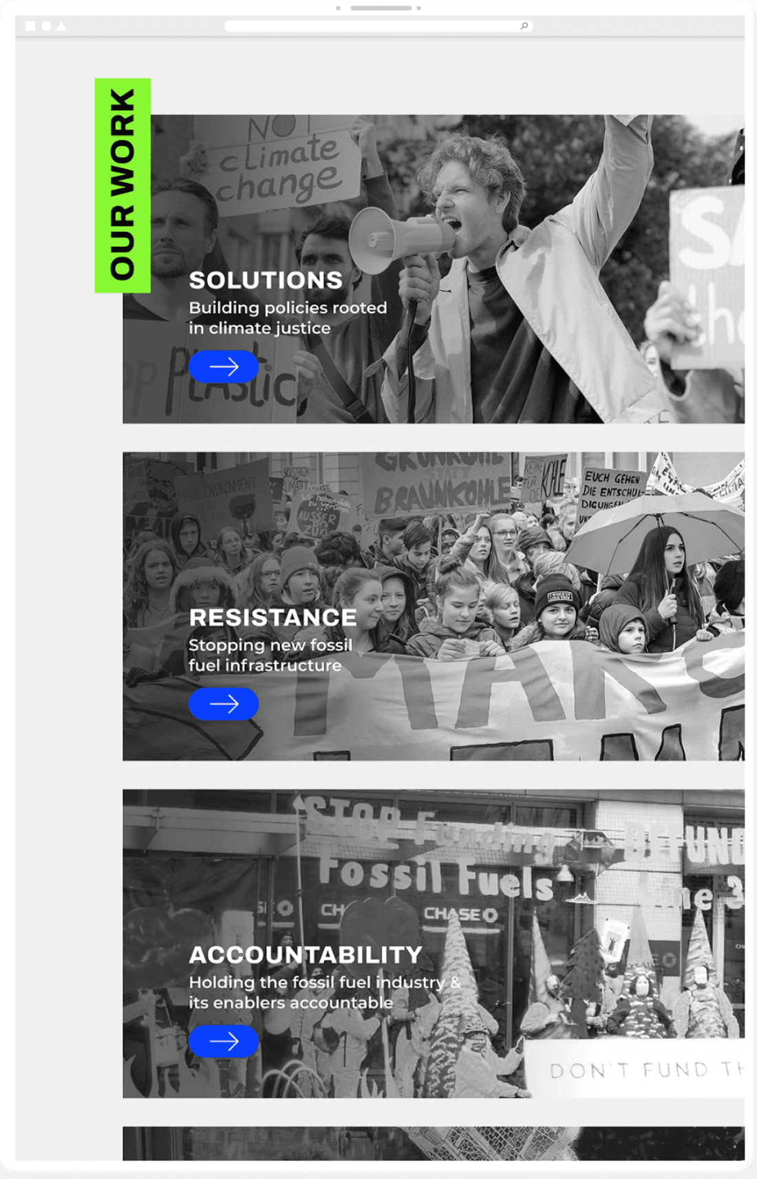
350 Seattle is an affiliated group to 350.org, whose goal is to reduce atmospheric carbon dioxide levels below 350 ppm. 350 Seattle ultimately shares the same goal with 350.org but they focus more on four key areas: Solutions, Resistance, Accountability, and Movement Support.
I chose to emphasize these four main achievements as the core of the brand, as they are central to shaping 350 Seattle’s identity. The organization stands out for its youthful energy and bold, action-driven approach, such as leading public protests, creating art, and actively sharing their beliefs and missions to advocate for climate justice.
Problem Analysis
To understand 350 Seattle’s current brand status, I analyzed its logo and website, and some issues were found that weakened the brand’s visual identity:
Typography lacked visual appeal, with poor font choices, weak hierarchy, and inconsistent layout, making content hard to follow
Colors are not branded
Overall tone of the brand felt boring and static, which contradicted the organization’s energetic, bold, and action-oriented spirit

350 Seattle’s current logo


350 Seattle’s current website
Brand Goals
These design goals will be the guideline for the rebranding of 350 Seattle. They are derived from the analysis of 350 Seattle’s current brand.

Brand Design Principles


Logo System
350 Seattle’s logo is a wordmark that reflects its goal of reducing the concentration of carbon dioxide in the atmosphere and making it go below 350 ppm (parts per million).
Primary

Secondary


Logo Variations
350 Seattle aims to share its values and work with others to make a beautiful world together. The arrow symbol, the primary version, is replaced by other symbols to reflect its values and works. This logo system makes the brand unique and fun. It also expresses the brand story of 350 Seattle making the world better.
Accountability
Resistance
Solutions
Movement Support
Typography
350 Seattle uses two different typefaces: Archivo and Montserrat. The typographic hierarchy creates a big contrast between titles and bodies, reflecting the urgency and boldness of 350 Settle.
Archivo’s boldness and robustness reflect the characteristics of 350 Seattle and catch the audience’s eyes. Monsterrat makes the readability high and creates great visual harmony with the website’s linear layout without killing content.

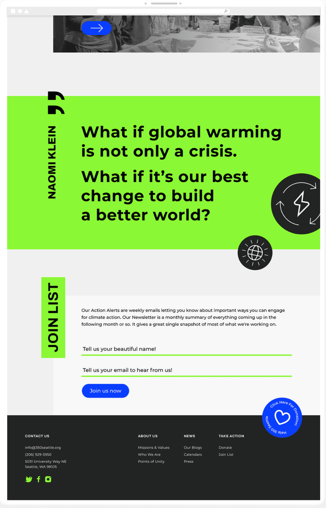
Brand Colors
350 Seattle is an energetic and active organization with strong climate justice goals. Brightening green and blue from its original logo and making them saturated hues deliver 350 Seattle’s identity.The primary colors are green and blue, symbolizing the healthy world. Their high saturation makes the brand strong and youthful. Secondary colors are shades of black and white. They are to support primary colors.

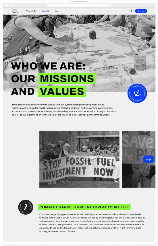
Brand Imagery
350 Seattle considers people as the heart of its organization. The images should focus on people doing action for the climate crisis. Monochrome creates a serious and urgent mood. The majority of photos should show people in groups participating in movements and activities fighting for climate justice.


Brand Imagery
The motif of these illustrations is a sticker, a medium often used for promotion. Illustrations in the circle represent the values of 350 Seattle that are shared with others. The use of illustrations makes the 350 Seattle brand more delightful and welcoming. They should not be overwhelmingly used on the website to prevent users from getting distracted.
Home page


About page


©2025 JULIA HYERIN CHOI. ALL RIGHTS RESERVED.